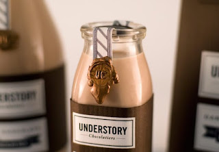
Understory


 Designed by Mark Johnson. I really liked this project mainly because of the colour scheme used. The company is a chocolatier so the chosen colours of browns and gold really give the illusion of luxury that chocolate is. The wax seal makes it look even more high end and expensive because a wax seal gives the impression of royalty.
Posted in Labels: butterbeer, ougd301 | Edit |

0 comments:
Post a Comment