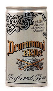
Vintage Beer Bottles
I stumbled over this set of vintage beer bottles and cans on Flickr and just had to add them to my context blog. The Wizarding World is pretty old fashioned in general so I figured I'd best look at some vintage beer labels and such to see how it was done back then. I wish beer labels still looked like this now, I think these look absolutely awesome. I picked out a range of my favourite ones to be shown on here.
I really like that the text on a lot of them is angled from bottom left to top right and puts the type on a slant, it definitely seems to be a theme running through them. I don't know if it was the done thing back then, but I really like it.
I also love the wide range of type from bold sans serif to gorgeous flowing script. The designs in general range from really simplistic and bold to very extravagant and indulgent looking.


 This one is, yes, a little bit racist but that's how it was back then.

I really like that the text on a lot of them is angled from bottom left to top right and puts the type on a slant, it definitely seems to be a theme running through them. I don't know if it was the done thing back then, but I really like it.
I also love the wide range of type from bold sans serif to gorgeous flowing script. The designs in general range from really simplistic and bold to very extravagant and indulgent looking.


 This one is, yes, a little bit racist but that's how it was back then.
Posted in Labels: butterbeer, ougd301 | Edit |

0 comments:
Post a Comment