
Firewhiskey

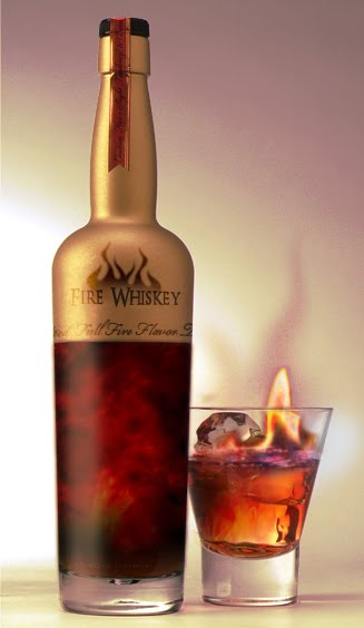
 These are a few Firewhiskey images that I found on Google images while rummaging about for Butterbeer. The top one is certainly interesting in that way that the label feels pretty appropriate for the universe that it's set in. I would never put whiskey in a bottle that shape however, it looks more like a brandy decanter than anything else.
I quite like the bottom one, it looks pretty high quality and the colour scheme works well. The idea of the inside of the bottle being as stormy as it looks. The logo is interesting without going over the top. Over all, I do like it.
Posted in Labels: butterbeer, ougd301 | Edit |
0 comments:
Post a Comment